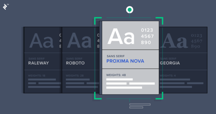
In modern design, sans serif fonts have become almost ubiquitous. Whether you’re navigating a website, reading product packaging, or viewing a billboard, sans serif typefaces are often the first choice. Their clean forms and adaptability make them ideal for contemporary branding, user interfaces, and print design. TypeType’s collection of sans serif fonts shows just how wide and powerful this style has become.
The Appeal of Sans Serif Fonts
Sans serif fonts—grotesques, humanists, geometric, neo-grotesques—are known for having no serifs (little finishing strokes), which gives them a simpler, cleaner appearance. According to TypeType, they range from understated and neutral to bold and expressive, making them suitable for nearly any design project.
One chief advantage is versatility. Sans serif fonts adapt well to different media: screens, print, signage, branding. They maintain legibility at small sizes (like in UI) and impact at large sizes (like posters or logos). TypeType emphasizes this adaptability.
See also: Philadelphiabased Gpsdenied 35m Series Reliance 107msinghtechcrunch
Popular Sans Serif Choices from TypeType
TypeType highlights several sans serif families that are especially popular and highly rated for use in digital, UI, and print work. Some of the standouts:
- TT Norms® Pro — a geometric sans serif described as a “trouble-free workhorse” by TypeType. It’s a bestseller for its clean, neutral design that works in many applications.
- TT Commons™ Pro — also geometric, similarly versatile, redesigned, and also very popular. It features many styles and is suitable for long text, branding, UI, etc.
- TT Hoves Pro — recognized for its geometry and design clarity, with 96 font styles (before specials or reductions) that allow flexibility for different media. It also often goes on sale.
- TT Firs Neue, TT Fors, TT Neoris — these also appear among TypeType’s most popular sans serif fonts. Each brings its own character (for example, geometric shapes, proportional contrasts, etc.).
Technical Strengths That Make Them Work
Sans serif fonts from TypeType are not just about style—they also bring strong functionality and technical features that enhance their suitability for branding, UI, and print:
- Many sans serif fonts in their collection come in large numbers of styles (weights, italics) which allows designers to maintain consistency across different platforms and media.
- Some are variable fonts (for example, TT Norms® Pro and TT Commons™ Pro), which means you can flexibly adjust weight or width rather than switching between discrete font files. That helps ensure responsive design in digital contexts.
- TypeType recently increased its glyph counts in the Compact, Normal, Condensed, and Expanded subfamilies from 1,573 to 1,716 glyphs per style, which improves support for symbols, punctuation, and special characters.
- They also expanded language support—going from about 200 languages to 270, which helps when brands go global or need to address multilingual audiences.
Why Brand Identity, UI & Print Benefit
Because sans serif fonts are clean, unobtrusive, and modern, they’re ideal for:
- Brand Identity: Sans serif fonts help establish a look that feels current, minimal, and professional. Brands wanting a modern appeal often choose them for logos, packaging, signage. The fact that TypeType’s most popular fonts (TT Norms, TT Commons, TT Hoves, TT Fors) are sans serif speaks volumes.
- User Interfaces: On screens, clarity is king. Sans serifs usually scale better, remain legible at small sizes, have lower visual noise, and work well under various resolutions. Also, variable fonts allow smoother transitions (lighter/darker weights) which helps responsive design.
- Print Work: Sans serif fonts are strong in large format (billboards, posters) and in clean editorial layouts. The simplicity can help printed materials stay elegant and not distract from content. Additionally, many TypeType sans serif styles support strong contrast, display weight, and versatile features for high-quality printing.
Conclusion
Sans serif fonts rule in branding, UI, and print not by accident but by virtue of their combination of clarity, adaptability, and style. TypeType’s sans serif collection—including TT Norms® Pro, TT Commons™ Pro, TT Hoves Pro, TT Firs Neue, TT Fors, and others—demonstrates just how powerful and varied sans serif options can be. With technical improvements in glyph count, style range, and language support, these fonts are more capable than ever across digital and print media.


